PROBLEM
Honey Homes was developing their new mobile app and needed a design system to base their screens on.
GOAL
The goal of this project was to establish design maturity for the application by shifting from one-off screens to a component-driven ecosystem. By auditing existing component usage, I built a foundational design system rooted in design tokens—standardizing everything from typography and spacing to UI elements. Alongside a refreshed color palette, I delivered a suite of responsive layout templates for core app views (Lists, Details, Profiles, and Chat). This now serves as a single source of truth that ensures visual consistency and drastically reduces time-to-market for new features.
PROCESS
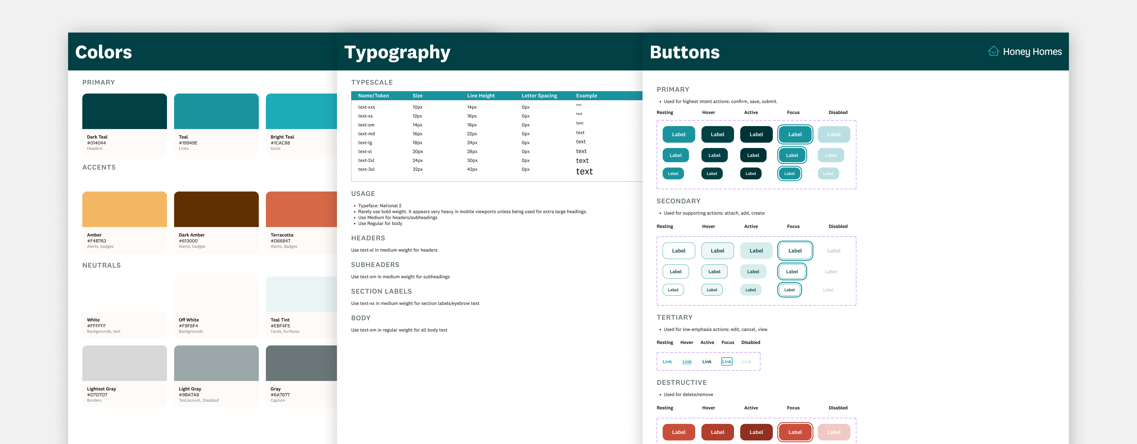
Before creating anything new, I had to understand what we already had. I conducted a thorough audit of the live application to catalog every button variant, input field, picker, and layout style currently in use. I then built the foundations such as typography, colors, and buttons. I would gather daily feedback from stakeholders to ensure we were on the right path as this was a short term project.
Once the foundations were set, I built out the rest of the system, focusing on high-impact atomic components (buttons, inputs, forms). From there, I combined these components into higher-level, reusable screen layouts for the team's most common use cases: Details, Lists, Profiles, and Chat.
SOLUTION
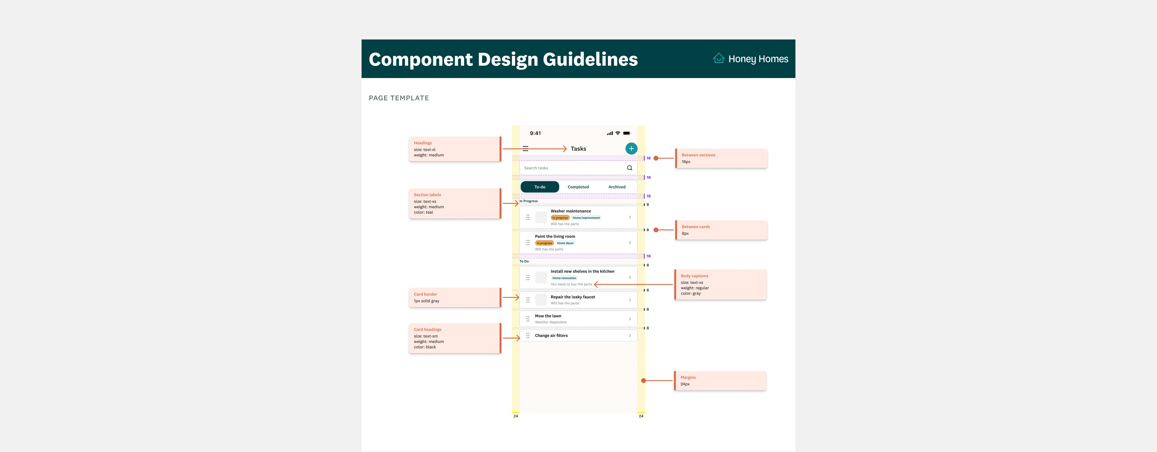
In addition to the design system, I also provided a component template with guidelines so that future designs could reference and build off of it.
OUTCOMES
By implementing this starter system and template suite, we eliminated design fragmentation across core user flows and established a unified visual language. This single source of truth cuts down future design iteration time and provides engineering with clear, reusable building blocks.”