PROBLEM
Waste Management (WM) customers frequently called support for routine tasks: checking pickup statuses, reporting missed collections, and paying bills. This created high operational costs and a frustrating experience for users who just wanted quick answers.
The old dashboard didn’t focus on customer’s needs and information was buried or hidden under other screens.
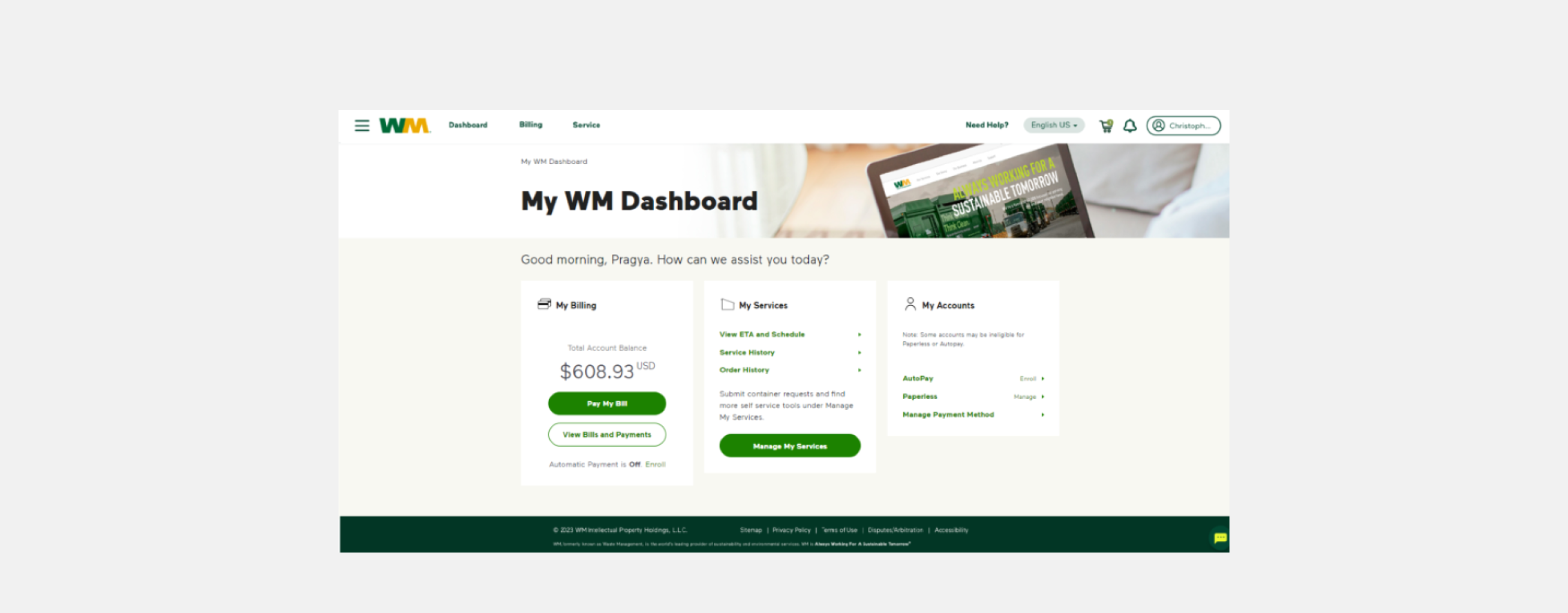
Old dashboard design
GOAL
To design a centralized customer portal that provides real-time transparency and intuitive self-service tools, ultimately reducing the volume of inbound customer service calls.
PROCESS
Discovery and Research
I worked with our research team to identify customer pain points when they were calling in. We discovered that over 60% of inbound calls from customers belonged to three repetitive categories:
- "Where is my truck / Why wasn't my trash picked up?"
- "How much do I owe, and when is it due?"
- Simple operational requests like scheduling an extra pickup or reporting a missed one.
Wireframe
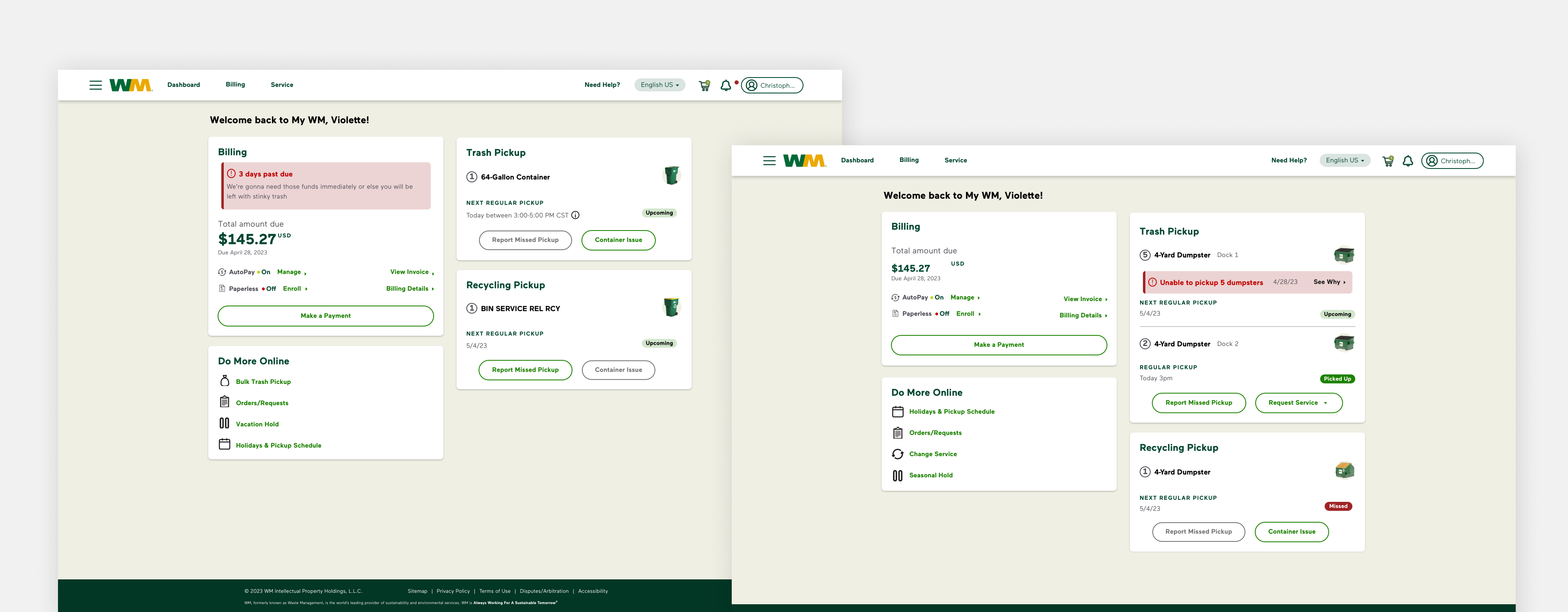
We structured the core dashboard into three clear zones based on user intent: Billing, Pickup Feed, and Quick Actions.
UI Design
In the final high-fidelity interface represented in the visual design was optimized for rapid scanning and immediate task completion:
- Cognitive Load Reduction: We used distinct visual treatments for different statuses—using a soft red banner for immediate operational blockers ("Unable to pickup 5 dumpsters") and clear green or dark red tags (Picked Up, Missed, Upcoming) to give immediate visual confirmation.
- Proactive Micro-Workflows: Rather than burying self-service tools deep in a navigation menu, we placed contextual primary actions—Report Missed Pickup, Extra Pickup, and Container Issue—directly inside the relevant service cards.
SOLUTION
The final design, focuses on three high-impact pillars: Financial Transparency, Operational Real-Time Data, and Request Automation.
1. Billing at a Glance
- Immediate Visibility: The Billing card highlights the total amount due and the due date in high-contrast typography, reducing "When is my bill due?" inquiries.
- Incentivizing Automation: Clear status indicators for AutoPay and Paperless billing encourage users to set up recurring payments, further reducing manual touchpoints.
2. Real-Time Service Transparency
The most innovative part of the dashboard is the Trash Pickup and Recycling feed.
- Proactive Issue Reporting: Instead of a customer calling to ask why their trash wasn't picked up, the dashboard displays a clear error state: "Unable to pickup 5 dumpsters" with specific reasons (e.g., "Blocked container," "Exceeded weight limit").
- Status Indicators: Using color-coded tags like Upcoming, Picked Up, and Missed gives users instant peace of mind without needing to contact a representative.
3. Streamlined Self-Service Actions
- Contextual CTAs: Buttons like Report Missed Pickup, Extra Pickup, and Container Issue are placed directly within the service cards. This intercepts the user’s intent to call and directs them to a digital workflow.
- The "Do More Online" Hub: A dedicated sidebar provides quick links to low-frequency but high-call-volume requests, such as Seasonal Holds and Holiday Schedules.
OUTCOMES
After implementing the new dashboard, we were able to see a 10% decrease in customer service calls. Customers gained 24/7 access to their account data and were able to do what they needed to do without having to call in.