OVERVIEW
Between May 2025 and January 2026, I designed and built a comprehensive digital design system for wm.com and its ecosystem of applications. To support the new design system, I led the migration of a legacy library from Sketch to Figma—transforming an outdated, underutilized system into a scalable and accessible foundation. This transition was an opportunity to not only modernize tools, but to rebuild components with greater clarity, flexibility, and alignment to real product needs. The result was a system that was easier to use, easier to maintain, and more widely adopted across teams.
Deliverables:
- New design system
- Styles & 10+ Components
- Documentation
PROBLEM
The existing design system had been built in Sketch, but over time it became difficult to maintain and gradually fell out of use. As teams and products evolved, it became increasingly disconnected from day-to-day workflows. Without a reliable, up-to-date source of truth, teams often recreated components or made one-off decisions, adding to the inconsistency across products.
PROCESS
I led the transition to Figma as an opportunity not just to migrate, but to rethink the system entirely. Rather than carrying over outdated patterns, I rebuilt components from the ground up.
We began by auditing existing products to identify inconsistencies, common patterns, and opportunities for standardization. From there, I defined a core visual language—establishing typography, color, spacing, and interaction principles that could scale across a wide range of use cases. With that foundation in place, I designed a library of reusable components, each built to be flexible, accessible, and grounded in real product needs.
Each component was documented with usage guidelines, states, and behaviors to ensure clarity and ease of adoption. Collaboration was central to the process. I worked closely with engineering to validate components in development, ensuring design and implementation stayed aligned. Rather than a one-time handoff, the system was treated as a living product—continuously refined through feedback and iteration.
The shift made a noticeable difference. With a more accessible and thoughtfully structured system, teams began to adopt it more naturally in their day-to-day work. What was once underutilized became a core part of the design process.
FOUNDATIONS
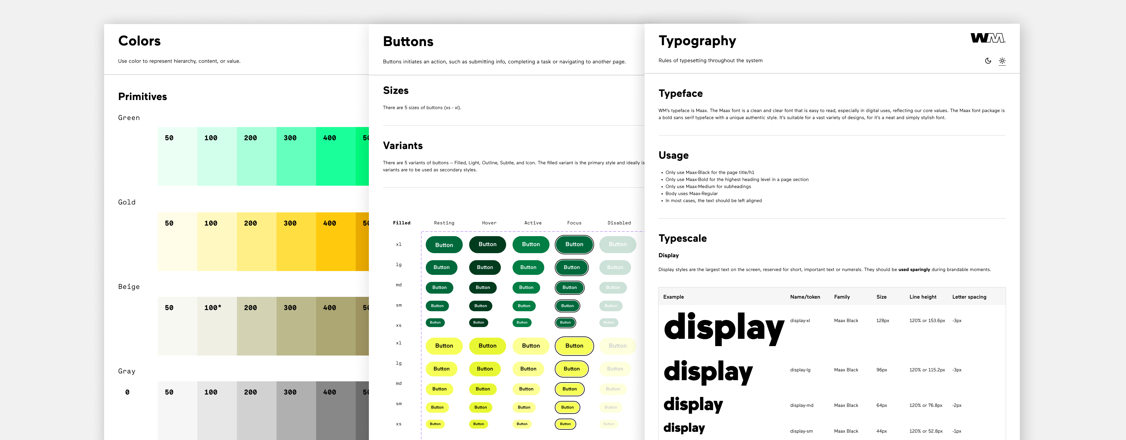
Brand colors were redefined into a scale of tints and shades to keep consistent color usage.
The button system was designed to create clear hierarchy, consistency, and ease of use across wm.com and its applications. I established a set of primary, secondary, and tertiary styles to guide user attention and reinforce action priority, ensuring that the most important actions are always visually distinct. Each variant includes defined states—hover, active, disabled, and focus—to support accessibility and provide consistent feedback across interactions. By standardizing buttons across the system, teams were able to make faster, more confident decisions while maintaining a cohesive user experience.
A consistent typescale was defined to be used on all text on the page establishing hierarchy between large bold headlines and smaller body text.
BASE COMPONENTS
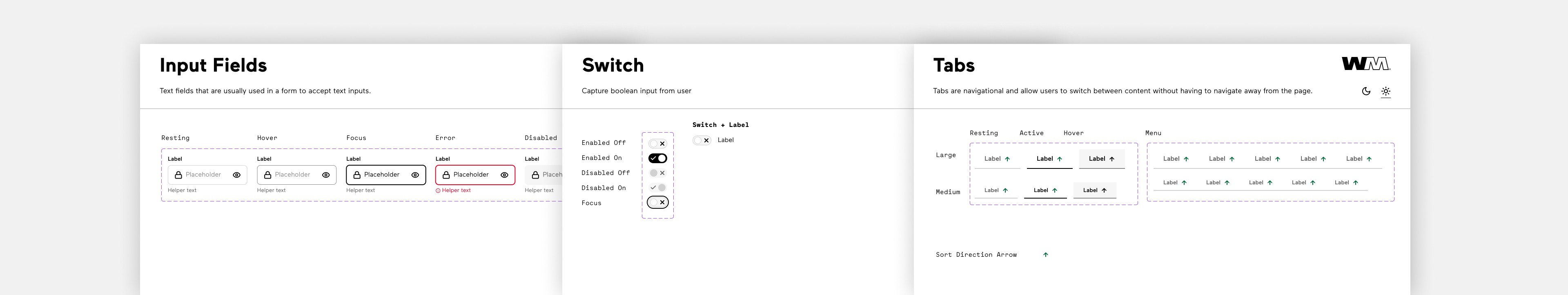
Base components were built to serve as foundations to larger pages and templates.
LIGHT & DARK MODE
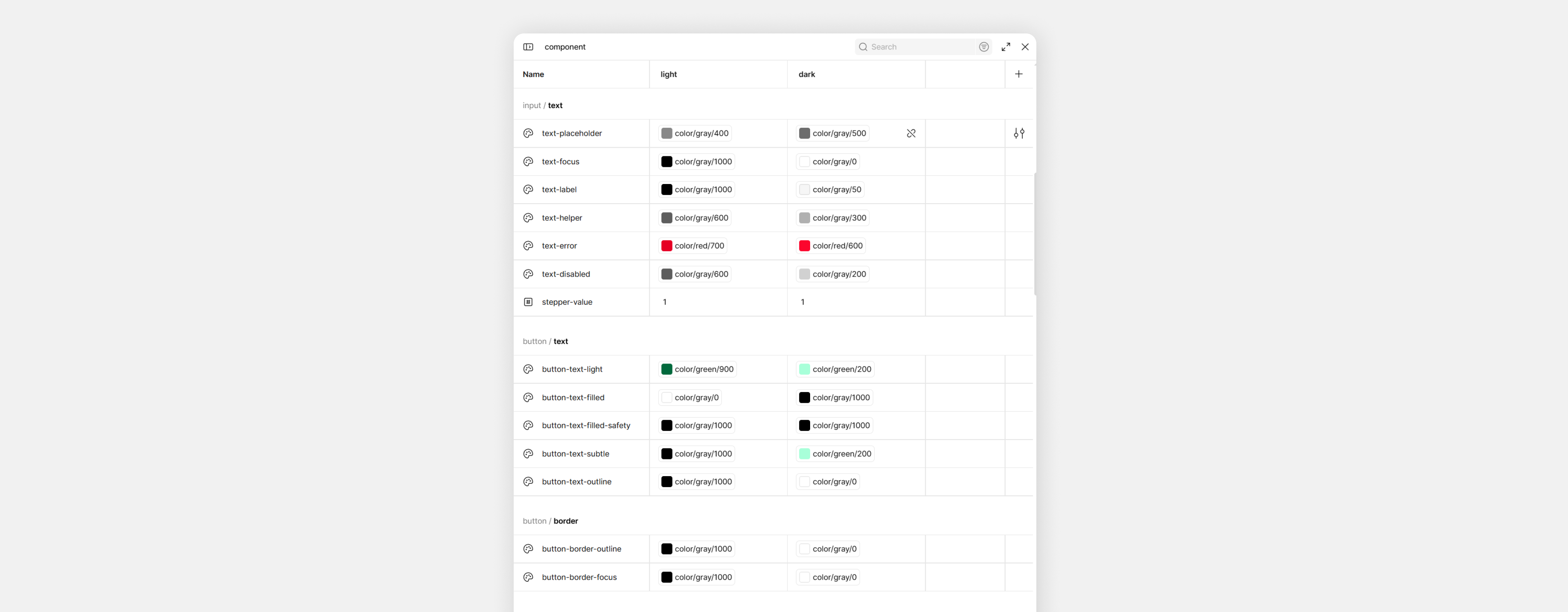
Using variable modes in Figma, I was able to create components for light and dark mode. I made sure to ensure colors had enough contrast for legibility in each mode.
OUTCOMES
Over time, the design system brought a sense of alignment back to the product. What once felt fragmented became more cohesive both visually and functionally.
Teams were able to move with more clarity and confidence, relying on shared components instead of starting from scratch. This reduced friction between design and engineering, improved efficiency, and made collaboration more seamless.
For users, the impact showed up in the details—a more consistent, intuitive experience across wm.com and its applications.
More importantly, the system created a foundation for what comes next. As the product continues to grow, it now has a framework that can scale with it—supporting new ideas, new features, and a more unified experience moving forward.
View Design System